

Oodles of Noodle (Power BI)
The Situation:
Oodles of Noodles is meal kit delivery service company. Our task is to derive meaningful insights into retail operations and customer behavior.
- Track KPIs (Revenue, Number of Shipments, Number of meal kits, avg review by customers, Active Customer Revenue , Active Customer Reviews, NO.1 Region by Sales, No.1 Customer by Sales , total Reviews).
- Region level Analysis which shows us the total shipments by each region, total meal kits sold in each region, Reviews by each region , Revenue trend by Regions, Also include the countries performance .
- Customer behavior Analysis which show us the customer trend by dates, Customer by each country, Subscription plan analysis , meal kit analysis .
The Data:
We have been given a collection of raw data (CSV Files) which contain information about Meal kit sold From 2020 to 2023.
The Task : We tasked with solely Microsoft Power Bi to:
- Connect and transform the data in Power Bi’s Back-end Power Query.
- Build a relational model, linking the fact and dimension table.
- Create calculated columns and measures with Dax.
- Design a multi-page interactive dashboard to visualize the data in Power BI’s Front end.
The Process:
1. Connecting and Shaping the Data
Firstly, we imported the data into the Power Query editor to transform and clean it. The next process involved:
Removing Duplicates: Duplicate entries were removed from the dataset to ensure accurate analysis.
Handling Null or Missing Values: For some columns, missing values were replaced with defaults or averages. Null values in “key” columns were removed using filters.
Data Type Conversion: Columns were converted to appropriate data types to ensure consistency. Dates were converted to Date type, numerical columns to Decimal or Whole Numbers, and text columns to Text.
Column Splitting and Merging: Several columns were split to separate concatenated information, or merged to create a unified name (such as Customer Full Name).
Standardising Date Formats: All date columns were formatted consistently to facilitate time-based analysis. This step was important for ensuring accurate time-series analysis in Power BI.
Removing Unnecessary Columns: Irrelevant columns were removed to streamline the dataset. This helped focus the analysis on relevant information, reducing memory usage and improving performance.
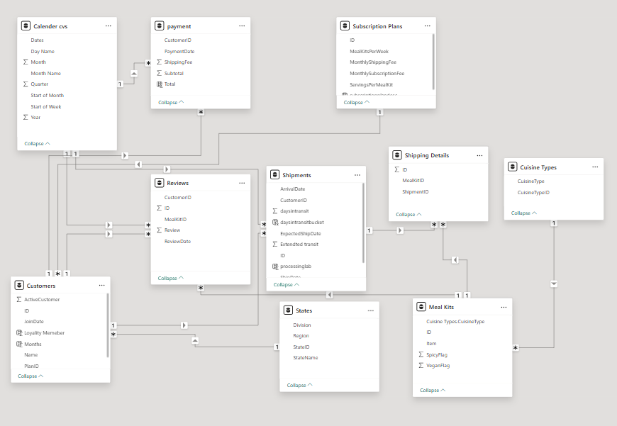
2. Building a Relational Data Model
Secondly, we modeled the data to create a snowflake schema. This process involved creating relationships between the dimension and fact tables, ensuring cardinalities were one-to-many relationships.
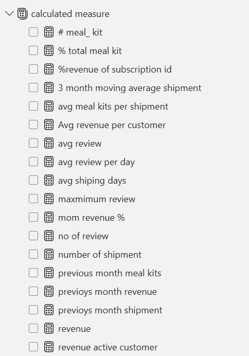
3. Creating Calculated Columns and Measures
Next, we used Power BI’s front-end formula language, DAX, to analyze our relational data model and create several calculated columns (for filtering) and measures (for aggregation), that we could later reference and use when analyzing and visualizing the data.
We used calculated columns to determine whether a customer is a parent (Yes/No), a customer’s income level (Very High/High/Average/Low), a customer’s priority status (Priority/ Standard), and the customer’s educational level (High School/ Undergrad/ Graduate).
The list of calculated measures is available below and includes key information on revenue, profit, orders, returns, and more.
4. Visualising the Data
The final step of the project was creating a multi-page interactive dashboard, including a range of visuals and KPIs that could serve management and lead to informed decision-making. We used several visuals and tools to demonstrate and visualize the data across the 4 report pages, including KPI cards, line and bar charts, matrices, gauge charts, maps, donut charts, and slicers. We made sure the report was fully interactive and simple to navigate, with icons used to enable filters, cancel filters, and guide users to each report page with ease. Features such as drill-through, bookmarks, parameters, and tooltips were also used throughout the dashboard, further enhancing its usefulness and impact on management.
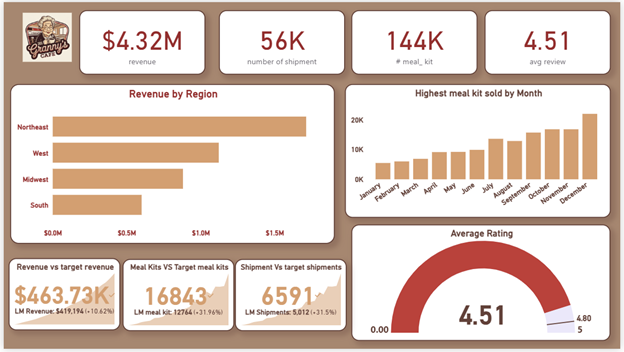
Executive Dashboard: Ths first report provides a high-level view of Oodles of noodles overall performance. We used Card Visuals to present key Performance indicators such as Total Revenue, Number of Meal kits, Total shipments, Average review. We also included a bar chart to show revenue by each region, a bar chart to show meal kit sold in each month, a gauge chart to show the reviews and target review and KPI cards to show this year and last year sale caparison in percentage.
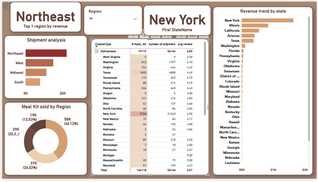
Region Level analysis: In Region Analysis , basically first l found the Number 1 region by meal kits sold, number shipments by each region, meal kits sold by each region, state revenue trend, and cusinie type performance in each cities by analyzing meal kits sold, number of shipment, avg review.
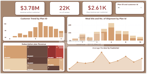
Customer &Subscriptionplan analysis: In this segment, I analyzed the Active customer revenue , avg review by customers and total review .i show them by KPI cards. I also analyzed the Customer trend by plan ID using bar chart. I also used a Tree map to show subscription plan performance .i create a line chart of avg review by customer to check the reviews by each customers. i used a stack bar chart to analyze the meal kits and no of shipments by plan ID.
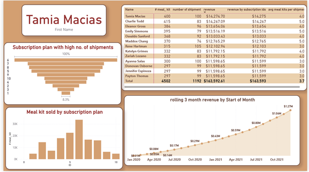
SubscriptionplanOverview: Top !0 customers by Revenue who purchased highest meal kits etc shows in matrix visual. I created a KPI card to show the top 1 customer who has the highest role in revenue .i used atimr intelligence functions to calculate the 2 months rolling revenue for this I used a line chart and I shaded the area for better visual and I added marker points to show the high and low breakouts. I used a funnel chart to visualize the subscription plan highest by shipments. I used a bar chart to see the Meal kits sold by each Subscription plan.