


365 Cosmetics (Power BI)
The Situation:
365 Cosmetics is a beauty Product brand which sells product of different categories include (face care, body care, home accessories ,Makeup , Hair care).
Our Task is to do :
- Product Performance Analysis
- Market Trend Analysis
- Current Period Vs last Period Analysis
- Customer Level Analysis
- Region level performance Analysis
- Customer’s Trend Analysis
The Data:
We have been given a Raw dataset (CSV Files) which contains information about Sales from Year 2020 to 2023.
The Task : We tasked with solely Microsoft Power Bi to:
- Connect and transform the data in Power Bi’s Back-end Power Query.
- Build a relational model, linking the fact and dimension table.
- Create calculated columns and measures with Dax.
- Design a multi-page interactive dashboard to visualize the data in Power BI’s Front end.
The Process:
1. Connecting and Shaping the Data
Firstly, we imported the data into the Power Query editor to transform and clean it. The next process involved:
Removing Duplicates: Duplicate entries were removed from the dataset to ensure accurate analysis.
Handling Null or Missing Values: For some columns, missing values were replaced with defaults or averages. Null values in “key” columns were removed using filters.
Data Type Conversion: Columns were converted to appropriate data types to ensure consistency. Dates were converted to Date type, numerical columns to Decimal or Whole Numbers, and text columns to Text.
Column Splitting and Merging: Several columns were split to separate concatenated information, or merged to create a unified name (such as Customer Full Name).
Standardising Date Formats: All date columns were formatted consistently to facilitate time-based analysis. This step was important for ensuring accurate time-series analysis in Power BI.
Removing Unnecessary Columns: Irrelevant columns were removed to streamline the dataset. This helped focus the analysis on relevant information, reducing memory usage and improving performance.
2. Building a Relational Data Model
Secondly we modified the data to create a Galaxy schema. This Process involved creating relationship between the dimension and fact tables, ensuring cardinalities were one-to many relationship.
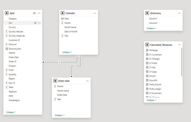
3. Creating Calculated Columns and Measures
Next, we used Power BI’s front-end formula language, DAX, to analyze our relational data model and create several calculated columns (for filtering) and measures (for aggregation), that we could later reference and use when analyzing and visualizing the data.
The calculated columns created are Total Sales, total profit, total cost, total customers , total orders to give info about the Major points and achievements. The comparison of this year sales vs last year sales, this year profit vs last year profit, this year orders vs last year orders. Subtract this year with last year number will give us growth of Revenue, profit, cost, customers, orders in Percentage%.
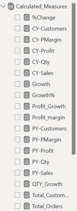
The list of calculated measures is available below and includes key information on revenue, profit, orders, returns, and more.
4. Visualising the Data
The final step of the project was creating a multi-page interactive dashboard, including a range of visuals and KPIs that could serve management and lead to informed decision-making. We used several visuals and tools to demonstrate and visualize the data across the 5 report pages, including KPI cards, line and bar charts, matrices, gauge charts, maps, donut charts, and slicers. We made sure the report was fully interactive and simple to navigate, with icons used to enable filters, cancel filters, and guide users to each report page with ease. Features such as drill-through, bookmarks, parameters, and tooltips were also used throughout the dashboard, further enhancing its usefulness and impact on management.
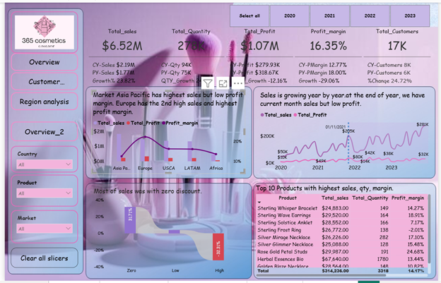
Executive Dashboard: The first page of report give the overall performance view .We used card visuals to show the KPI like revenue ,Quantity, Profit margin, Profits, Customers. We use new card visuals to compare number of this year vs last year with growth in per%. Next we analyzed market analysis using a line and cluster column chart .Then I create a line chart to analyzed the Sales and profit trend . We used a matrix visual to show the performance of top 10 products. The variation of customers in discount bins. Some of the customers did not take the Discounts .You can see the visual picture :

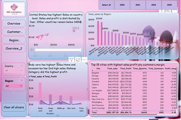
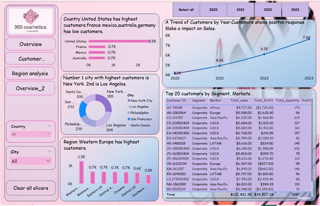
Region Level analysis:First , We analyzed the top country performance using a scatter chart which shows by a bubble which country has highest volume in sales. Then, We analyze the Region level performance by a column chart . we use a Line and clustered column chart to see Category performance .Then a matrix visual to see top 10 cities by sales,
Customer analysis: In customer analysis, We first analyzed the performance of customers by Country, City and Region . A line chart to see the time trend of customers which is increasing month by month. A matrix visual to see the top 20 customers by Market, and segment.
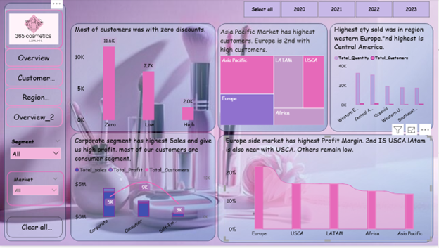
Overview: In last page, We use a column chart to see how many of the customers was with zero discounts and with discount.. We use a tree map to see the market with highest customers. We also focus on a region level quantity analysis. In segment analysis, analyzed the total sales, customers , profit by each segment. further analyzed the profit margin by each Segment .
Bookmark Page : A bookmark page to see a specific country Pakistan sales which city has high sales, quantity sold , margin .one is for cities analysis and one is for overall main overview.Press one button and a new screen appear as a new information of Pakistan cities.